This salon is one minute work from A4 exit of Omotesando station.
The word “munica” in the salon name is a coined word of “mi” and “unica” of Spanish.
“mi” means “my”, and “unica” means “only”.
The logo of the salon was designed with the wish of “like one and only flower.”
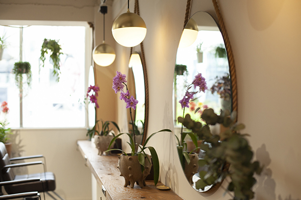
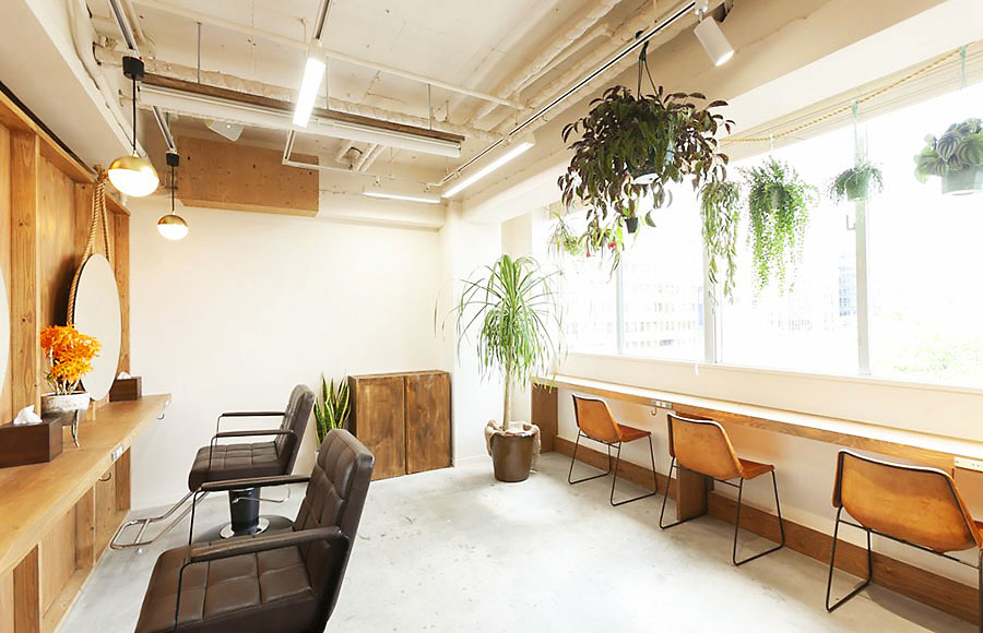
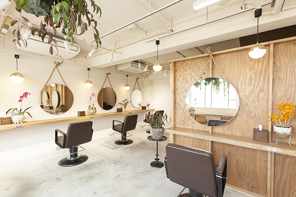
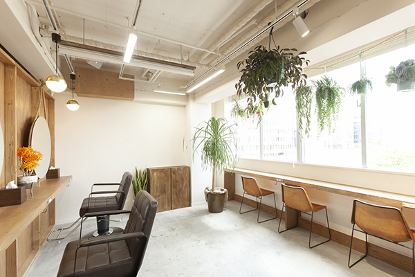
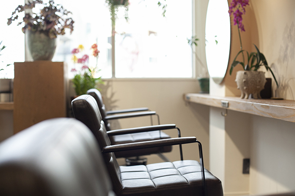
For a career woman who works in Omotesando, we designed a space full of greenery in the image of zelkova, the symbol of the town.
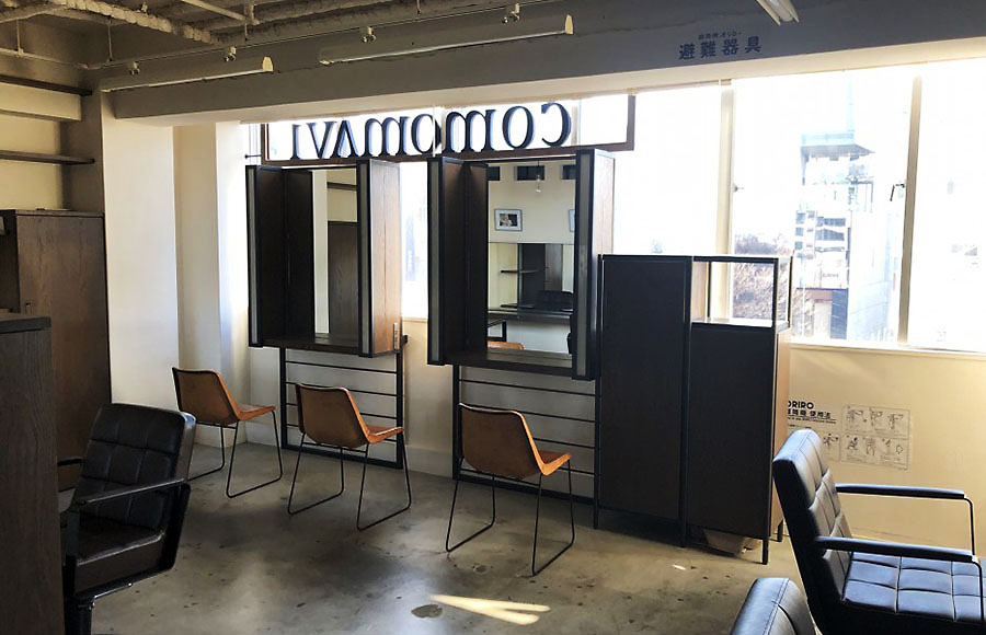
It was a big challenge to create a sense of unity with Omotesando within a limited budget,
but we worked with the owner to work out the concept and focus on cutting unnecessary things.
In the daytime, we designed a healthy and refreshing space with lots of natural light.
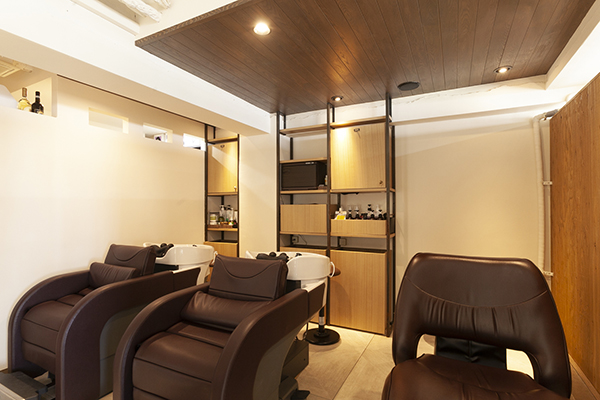
At night, we changed the image, and designed an elegant space by using indirect lightings.
In addition, by seeing the growth of plants in the salon, customers can feel their own growth.
We hope customers will enjoy the luxurious forest baths in Omotesando.

